|
◎
Station Design
◎ |
|
 |
 |
◎Lin,
Xiao-Ni◎
Look and
Characteristics:
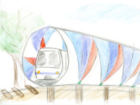
The station building
is like a cocoon of a butterfly and the train is like a
butterfly bursting out of the cocoon.
Design concept: The station is expected to locate at
the Shilin District Office of the Circular Line North
Section. The modern station fits with Taipei
Astronomical Museum and National Taiwan Science
Education Center in the neighborhood. The sky blue
station echoes the Meilun Park nearby. The
butterfly-like train bursting out of the cocoon station
symbolizes a new start.
|
◎Lin, Wei-Jen◎
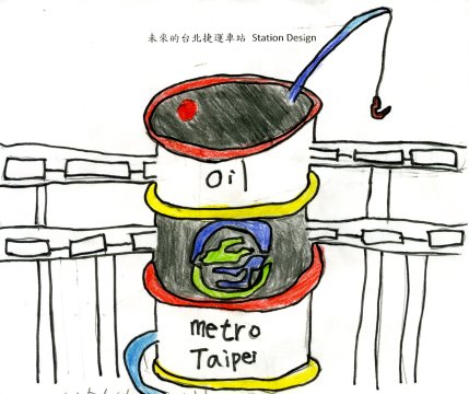
Look and Characteristics: The
station is like an oil barrel because the Diaoyu Island
offers rich fishing grounds and has potential oil reserves,
so fishing rods are added.
Design concept: It is an elevated station and the
ring of the barrel is the passage to each floor of the MRT
station. The look of the oil barrel and fishing rods
symbolize the prospect of economic development. |
|
|
|
 |
 |
|
◎Yang
Kuan-Ting◎
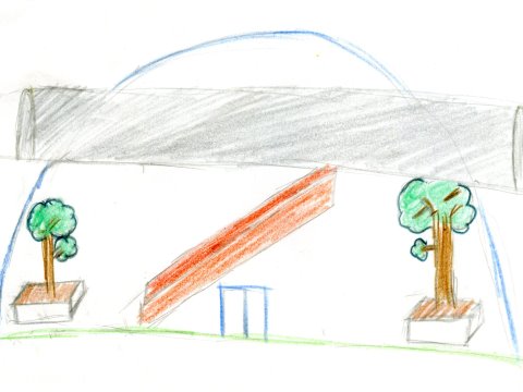
Look and Characteristics: The
main material is glass for light to penetrate. The upper
part is the railroad and track for trains. There are trees
inside and outside the station.
Design concept: The station is like a small park with
power saving. It is lit up with the natural sunlight during
the day and it only turns on lights at night. Everyone can
slow down here and enjoy the beauty of life. |
◎Huang, Yi-Kai◎
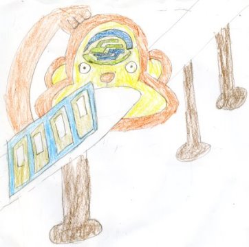
Look and Characteristics: Taiwan
Macaques are the endemic species in Taiwan, so I design the
station as a monkey. The station is an elevated one and the
MRT trains drive in through an entrance like the monkey’s
mouth.
Design concept: Monkeys are energetic and dexterous
animals, and Taiwan macaques are endemic to Taiwan, so I
hope that monkey-shaped station will make people feel the
vibe of Taipei Metro. |
|
|
|
 |
 |
|
◎Li
Rou-Ying◎
Look and Characteristics: It is
like a small green house, a transparent dome glass house
with lots of flowers and plants inside.
Design concept: It is expected to be located in the
future Botanic Station. It will be a modern greenhouse where
people are surrounded by trees and they may feel they are in the
nature. |
◎Weng, Chao-Hung◎
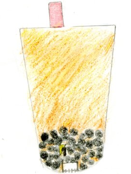
Look and
Characteristics: Bubble milk tea.
Design concept: Bubble milk tea is a very well-known
and representative beverage in Taiwan, so I use an oversized
cup of bubble milk tea to represent the distinctive station. |
|
|
|
 |
 |
|
◎Ho
Pin-Yi◎
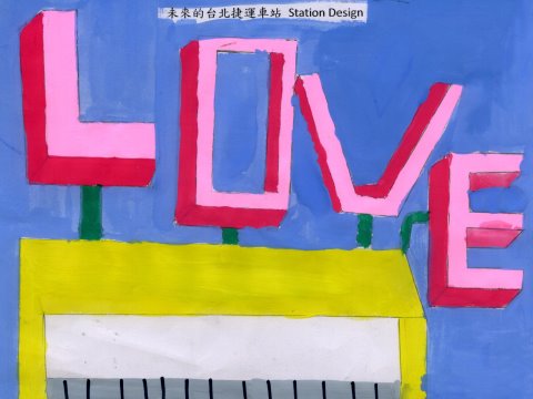
Look and Characteristics: The
“LOVE” above the station highlights the ideas of love,
listenting, and respecting.
Design Concept: LOVE as a whole expresses respect and is
thoughtful and encouraging for oneself and others. Listen
attentively to each other and feel each other’s feelings
with their heart. |
◎Lin
Hsiao-Hsuan◎
Look and Characteristics: It is a
big round cake with the word “LOVE” on the front. There are
hearts on each layer and on the top is a heart surrounded by
candles.
Design concept: I design Xingfu Staion on Circular Line
as a station full of love. The station is like a cake and
hearts are everywhere in the station. I want to send
messages of love and happiness to people who walk in the
station. |
|
|
 |
 |
|
◎Chen
Yu-Fen◎
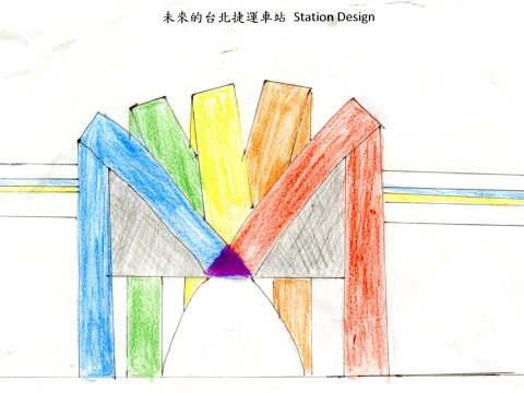
Look and Characteristics: The
station uses three primary colors; the color brown, as the
mix of the three primary colors, shows richness and
diversity.
Design concept: Blue stands for eternity, red for
passion, and yellow for light and hope. I hope everyone can
feel the enthusiasm from the station and move forward with
light and hope. |
◎Liao
Jia-Ying◎
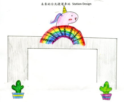
Look and Characteristics: There
are unicorns on the main cement wall of the station and
cacti are planted at the entrance of the station.
Design concept: The unicorn-shaped billboard and rainbow
on the simple cement wall and the cacti at the entrance give
out the enlivened atmosphere. |
|
|
|
 |
|
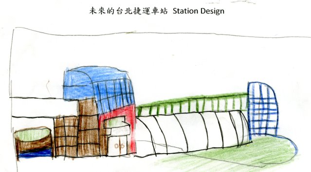
◎Lin Wen-Lan◎
Look and Characteristics: The
station is on the ground with a sunken garden. The main
material of the station is glass, allowing light to
penetrate into the station.
Design concept: The station is based near a park and
blends in with the surrounding natural environment. The
station is brightened with natural light, which saves
energy, and shutters of the windows can be adjusted at any
time. |
|
|
|
 |
 |
|
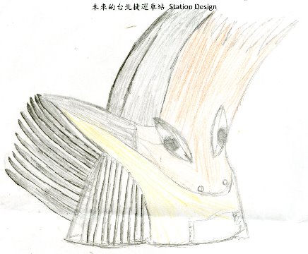
◎Li
Bo-Ying◎
Look and Characteristics: The appearance is a white
dove, which is the symbol of peace and freedom. I hope that
the station can bring people a life with hope and
convenience.
Design concept: For the citizens in Taipei City and New
Taipei City, everyone looks forward to life with hope and
freedom. Therefore, I choose a white dove as the main look
of the station. The color pure white symbolizes the
cleanness of the station, and the flying wings are for
prosperous future with hope and freedom. |
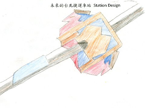
◎Jiang
Cheng-Yu◎
Look and Characteristics: The
platform of the station is similar to the body of the
launcher, and the exit of the launcher is the Metro track.
Design Concept: The Metro train is like shooting from a
launcher, symbolizing the MRT network extending in all
directions. It represents an ideal world with a sense of
future. |
|
|
|
 |
|
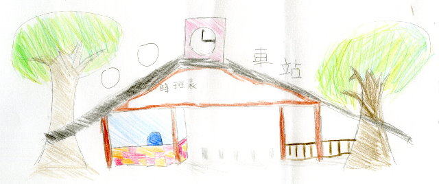
◎Zeng
Huan-Zhi◎
Look and Characteristics: Maximum use of recycled
materials combining with the natural environment.
Design Concept: The station has a simple structure and
it is a green building with minimum use of building
materials. The use of black tiles is for absorbing the heat
in winter and shading the light in summer. The wooden
material of the station can be adjusted according to the
seasons, helping people be connected to the nature. |