Meaning of the Logo
The LOGO on A-Zen Bakery’s gift box and bag expresses warmth and beauty, which was designed by Mr. Cheng’s daughter, Hsueh-yi Cheng, who took a major in advertising and design at college.
Intended to make the LOGO of the bakery different from others, she chose Chinese painting to express the traditional spirit of China. After painting 100 pictures of baozi, she picked the most satisfactory one to be the new LOGO for A-Zen Bakery.
She pointed out that the four colors, red, orange, black, and white, of the LOGO convey differing ideas about their baozi. Red stands for enthusiasm and auspiciousness, orange stands for fragrance, while black and white aim to convey the original touch of a Chinese brush.

The A-Zen 's bakery cake box.
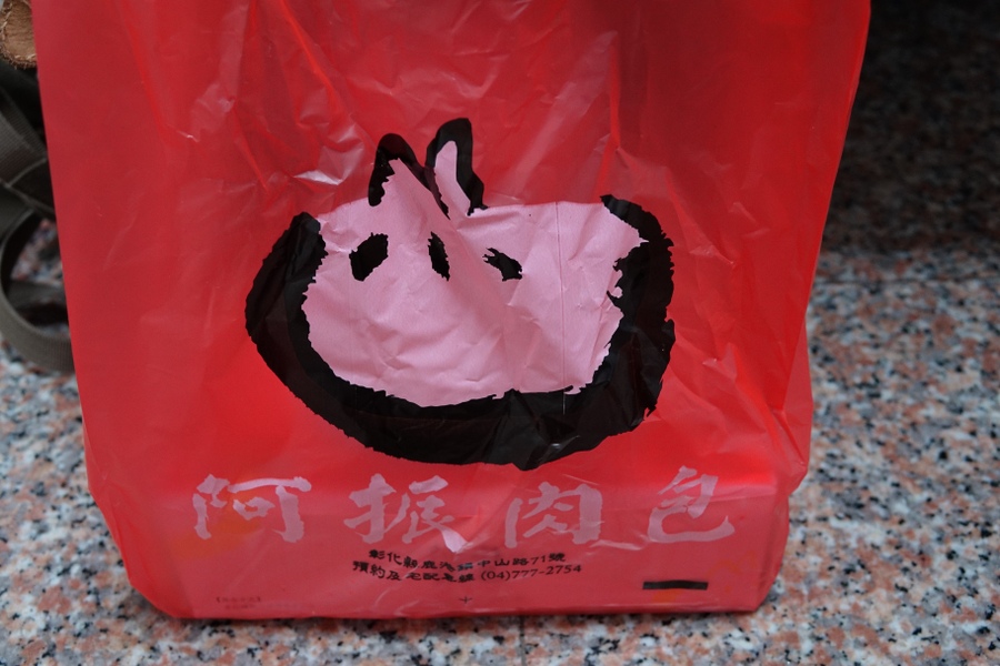
The A-Zen 's bakery bag.
Article and Photo by Project team.
References:Talking with Mr. Cheng. and his daughter.